| Corporate Identity | ||||||||||||||||||||||||||||||||||||||||||
The Lakehead University Corporate Identity is derived from the Lakehead University Coat-of-Arms. Central to the design are the waves, book, and sun as symbols of proximity to water, knowledge, and enlightenment. The Lakehead University Corporate Identity is to be used on branded merchandise, signage, communications, and marketing. The consistent use of the Shield in all of Lakehead materials will portray academic credibility to all audiences. If you require the Corporate Identity, please contact the Senior Marketing Advisor.
There are three options for the Lakehead University Corporate Identity; full colour, full colour on a dark background and one-colour, including black, reverse, colbalt, etc. Use one of the following logos. The specifications below also refer to reverse-colour printing situations, where the Corporate Identity must stand out in a black or dark single-colour field.
Colour Options for Dark Backgrounds Occasions will arise when the logo will need to be reproduced on a dark background. A version of the corporate identity has been produced to ensure proper reproduction in these instances. You will notice a shift from the non-reverse version of the logo in the wave pattern. Please ensure the background is dark enough to provide the necessary contrast.
The Lakehead University Shield may be used independently of the Wordmark. The Shield itself is a strong symbol of not only Lakehead University but of tradition and academia. Within the context of a clearly branded marketing product the Shield can be used as a graphic element and icon of Lakehead University.
Clearance and Size Restrictions The Corporate Identity must be located within a mandatory free and clear area around the top, bottom, and sides. This safety area ensures that the Lakehead University Corporate Identity is always seen with optimum clarity and is not compromised by other graphic elements. The logo must be surrounded by white space, no less than the space of a lower case “a” on all four sides.
Usage Guidelines The Lakehead University Corporate Identity may not be altered in any way.
| ||||||||||||||||||||||||||||||||||||||||||
| Unit Identity | ||||||||||||||||||||||||||||||||||||||||||
Faculty, school, department, office, or centre names within Lakehead University shall always be expressed in a consistent manner. They are positioned to the right of the vertical key line. Name uses a single line The baseline of the Faculty name must align horizontally with “Lakehead.” Name requires two lines The baseline of the first line of the Faculty name must align with “Lakehead.” The baseline of the second line of the Faculty name must align with “University.” Prominence of Faculty, School, Department, Office, or Centre The academic name of each Faculty is more prominent than the words “Faculty of.” Unit Identities have been designed to give prominence to each academic department. Colour Options The unit identities may be reproduced in black, reverse, or the colour option for dark backgrounds. If you require a unit identity for your Faculty, School, Department, Office, or Centre, please contact the Senior Marketing Advisor. | ||||||||||||||||||||||||||||||||||||||||||
| Tag Line | ||||||||||||||||||||||||||||||||||||||||||
The Lakehead University tag line is presented in a way that expresses contrast between the words: Exceptional and Unconventional. The treatment variables include setting both words at the same size, or increasing the size of Exceptional so that it stacks uniformly giving Exceptional and Unconventional the same width. The colours and/or tones of each word should be treated differently so as to heighten the contrast. This is true even in a one-colour environment where a tone or screen can be used in conjunction with a 100% value. The tag line is to be used on communication tools related to marketing, recruitment, and spirit. If you require the Tag Line, please contact the Senior Marketing Advisor.
| ||||||||||||||||||||||||||||||||||||||||||
| Colour | ||||||||||||||||||||||||||||||||||||||||||
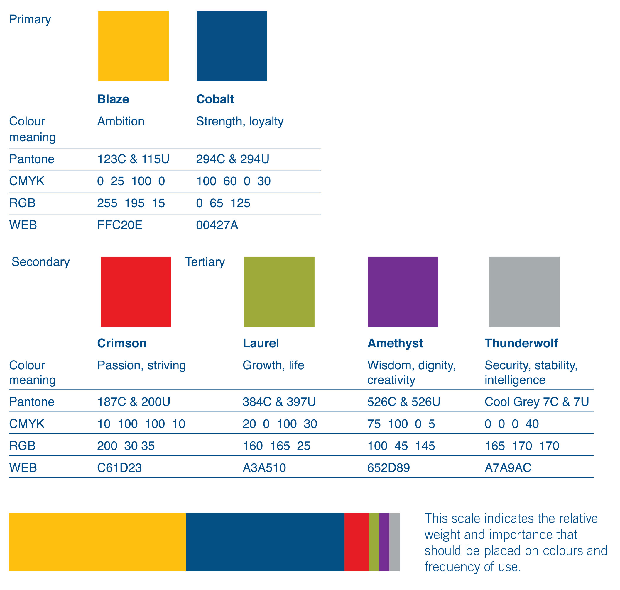
The Lakehead University Corporate colour palette is based on a core set of colours. The colour system reflects an academic, rich, and dynamic Lakehead. Blaze and Cobalt will be the primary corporate colour, a nod to our history that is reinforced in every communication. Blaze (C0, M25, Y100, K0) and Cobalt (C100, M60, Y0, K30) will be the Primary colours used in all communication and the Secondary and Tertiary colours are used only as accent colours. Crimson (C10, M100, Y100, K10) is our secondary palette member, also found in Lakehead’s past (see Lakehead Coat-of-Arms) and should be used as an accent colour only. Laurel (C20, M0, Y100, K30), Amethyst (C75, M100, Y0, K5), and Thunderwolf (C0, M0, Y0, K40) are the tertiary colours in the palette which add depth and range, and like Crimson, should be used as accent colours. All colours have deep and passionate intensity but may also be used as percentages.
| ||||||||||||||||||||||||||||||||||||||||||
| Fonts | ||||||||||||||||||||||||||||||||||||||||||
Lakehead University has three brand fonts: Trade Gothic, Georgia, and Arial. Trade Gothic is a licensed font. Arial is an excellent font for making accessible documents. | ||||||||||||||||||||||||||||||||||||||||||
| Photography Style | ||||||||||||||||||||||||||||||||||||||||||
Photography is a powerful way to convey the Lakehead University brand. Lakehead photography must feature people in a dynamic, experiential environment that conveys an exceptional and unconventional approach to learning. The individuals should be shot in an inspiring and informal way and should be obviously engaged in what they are learning, or have learned. For access to the Lakehead University image gallery contact the Communications, Marketing and Web Development Department at marketingsupport@lakeheadu.ca. | ||||||||||||||||||||||||||||||||||||||||||
| Brand Architecture | ||||||||||||||||||||||||||||||||||||||||||
Lakehead’s brand architecture consists of five brand classifications. Each typology has visual guidelines that will help clarify Lakehead’s diverse composition.
|
Brand Guidelines
About the Lakehead Brand
The Lakehead University Brand Guidelines is a tool that demonstrates the consistent expression of the Lakehead University brand.
When the Lakehead University brand is expressed consistently, it reinforces the universally accepted value of Lakehead University. Adhering to the Brand Guide Book is absolutely essential.
The Brand Guidelines are not intended to limit creativity. It empowers communicators to deliver unique messages in a manner that reinforces what the Lakehead University brand stands for. It will provide guidance for the correct use of graphic elements such as the corporate and unit identities, colour system, fonts, etc.
If you require clarification or would like to request any of the Lakehead Brand resources, please contact the Communications and Marketing Associate.


