About our Logo
 How was the Centre for Rural and Northern Health Research (CRaNHR) logo conceived? As an arts integrated researcher who uses the arts in research design, I used a methodology called Parallaxic Praxis.There are three stages in this framework: data, analysis, and rendering. In the first phase I examined the data. What does CRaNHR do? What do the people who are part of the Centre value? What is CRaNHR's vision? I examined the website and thought about the people who work in the Centre. I then tried to translate those ideas into a symbolic form. I took all I understood about CRaNHR and tried to distil what was important.This is the analysis part. The rendering is the artefact that holds the ideas I was thinking about. The beauty of this methodology is that the rendering can never be all that CRaNHR was, is, and will be. It is only my connection with the data at this point of time that is represented. The logo is always only a small snapshot of some ideas pertaining to the Centre.
Researchers use the Parallaxic Praxis method to start conversations. I could ask, what do you think the logo represents for you? As a logo, it attempts to hold some of the Centre's values.
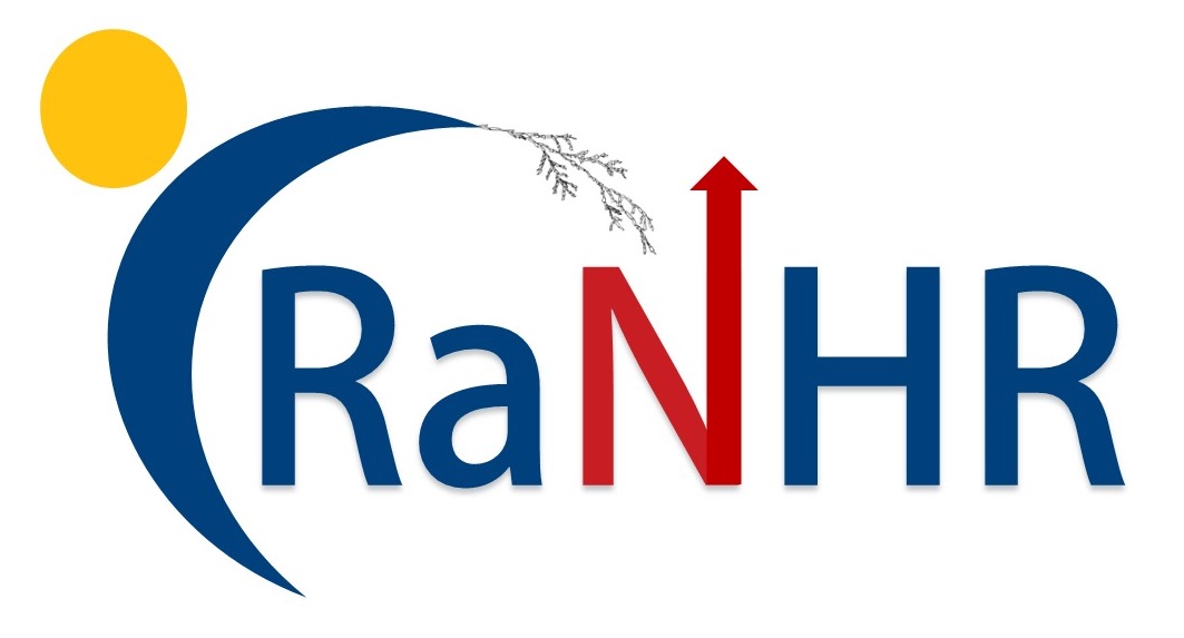
As I created the logo, I was hoping to demonstrate a sense of care, inclusion, protection, and reaching out. To contextualize the Centre, I used Lakehead's brand colours. The sun and the moon speak of continuity, a sense of ever changing—rising and setting, work that is not fly-in or fly-by. This Centre cares about community wellbeing that is rooted in the seasons and in time. The sun is the head of a crescent moon body (the embodied 'C' reaching out to the N (north) with a cedar leaf. Thuja occidentalis, the eastern white-cedar, also known as the northern white-cedar is indigenous to the Boreal Forest and a common tree species of this region. Known as the "tree of life," cedar is used in Indigenous smudging ceremonies for blessing, cleansing, protecting, and healing. The cedar was drawn by hand and integrated in what might look more like a corporate logo. The 'realness' of the leaf is to bring across a feeling of CRaNHR as not being standardized. The texture of the cedar demonstrates a welcoming of diversity that creates depth and care. In making the red N, with the iconic compass north symbol, I used a flatter arrow to allude to a house roof, to create a sense of home and love.
Pauline Sameshima
Professor and Canada Research Chair in Arts Integrated Studies
solspire.com

